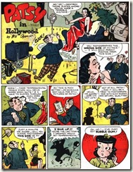
Some long-forgotten gems of classic comic strip art popped up recently on Ger Appledorn’s wonderful website about comic strip art from “Those Fabuleous Fifties”.
According to Ger’s intro, “Patsy in Hollywood” ran under varying titles in the forties and early fifties, and was helmed by a succession of artists from the Milt Caniff stable. The jokes in these strips may be very pedestrian…
… but the artwork, staging and storytelling are really great! Modern comic book and comic strip artists could learn a TON from these strips.
Click on any of the images below to jump to the FULL-SIZED
Comic book scans on Ger’s “Those Fabuleous Fifties” Blog
Comic book scans on Ger’s “Those Fabuleous Fifties” Blog
For example, the topmost strip (above) features figures that are full of life and dynamic angles and S-curves. Nobody is standing straight and rigid. Even the stuffy matron in the last panel has a very dynamic pose.
Click on any of the images below to jump to the FULL-SIZED
Comic book scans on Ger’s “Those Fabuleous Fifties” Blog
In the second strip, look at how cartoonist Bill Dyer implies a big movie studio in the background with just a few blobs of ink. He uses heavy blacks on the starlet's boobs to emphasize her bombshell qualities. Andrew and Patsy both have character designs that read like crazy in silhouette! That's great design. The body language in panel three is a joy to behold, and look at how the two kids have totally different walking poses in panel four!Comic book scans on Ger’s “Those Fabuleous Fifties” Blog
Lastly (for this strip) look at the clear storytelling on that last panel. He makes sure to put the gag in the foreground where it's clearly staged and impossible to miss.
Click on any of the images below to jump to the FULL-SIZED
Comic book scans on Ger’s “Those Fabuleous Fifties” Blog
Comic book scans on Ger’s “Those Fabuleous Fifties” Blog
Finally-- the third strip. In the opening panel, look at the way all the foreground elements, props and designs point straight to the movie star. Once again, the cartoonist keeps the staging and posing interesting, and he makes sure to use a close-up on the punchline in the last panel.
Great great stuff! Thanks for to Ger for sharing this!
His “Fabuleous Fifties” site is one blog I check every day.
His “Fabuleous Fifties” site is one blog I check every day.
Take a look at:
http://allthingsger.blogspot.com/2008/12/when-leonard-starr-offered-sveral-ideas.html


3 comments:
Ohhhh those fabulous fifties!! I swear I was born and raised during the WRONG time period!! I missed the 50's by some 10 years or so and I just have such a love and passion for the art that came out of that world! I wasn't designed for the period in which we live now,...but I'm struggling to manage anyway! LOL!
Hey, Todd...I know what you mean about missing out on those decades of great art and design and style. Thanks to the blogosphere and archivists like Ger, at least we get to have a little taste of all the old stuff.
Great post, Sherm! Especially where you're talking about staging and using background and prop elements to enhance composition. Something I know I try to do...keep everything alive and purposeful in each panel.
Post a Comment