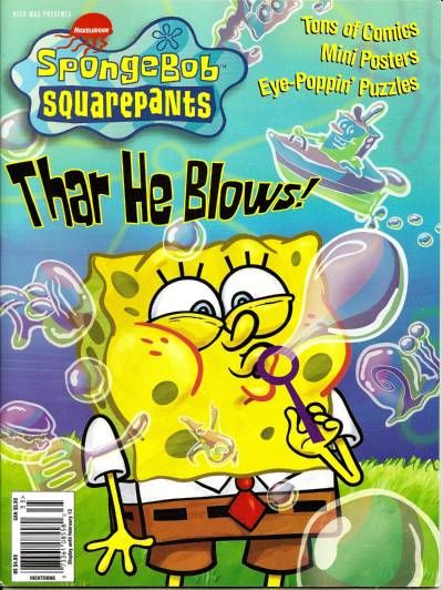
It's been a while since I did storyboards on the SpongeBob
The three sketches below are my first attempts to draw SpongeBob
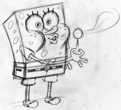
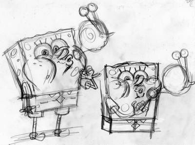
Well, it turns out there's not enough room on the cover to have that bubble so far from his face, so I had to try to have SpongeBob facing frontward, with the bubble overlapping his face, but without obscuring his smiling features!
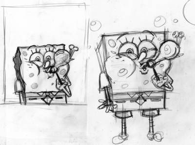
This took quite a bit of pencil wrangling, but by the time I drew the two sketches below, I thought it was working OK. The sketch on the left is the one went with, but I kept drawing. Even after I think I've nailed it, I try to do more drawings to see if something unexpected happens. In this case, the next drawing I did wasn't as good, so I decided to take the good one and scan it in so I could play around with the composition.
This took quite a bit of pencil wrangling, but by the time I drew the two sketches below, I thought it was working OK. The sketch on the left is the one went with, but I kept drawing. Even after I think I've nailed it, I try to do more drawings to see if something unexpected happens. In this case, the next drawing I did wasn't as good, so I decided to take the good one and scan it in so I could play around with the composition.
Next, I threw in a whole buncha bubbles to show that SpongeBob has been having a great time amusing himself with his boundless bubble creativity. His bubbles were supposed to reflect his hopes, dreams, wishes and obsessions. I used TV Paint 8.5 tough up the sketch and cobble all the bubble drawings together into this pretty-much-finished pencil drawing below:
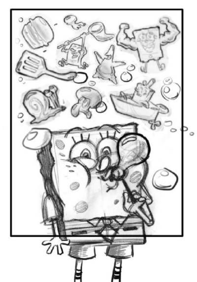
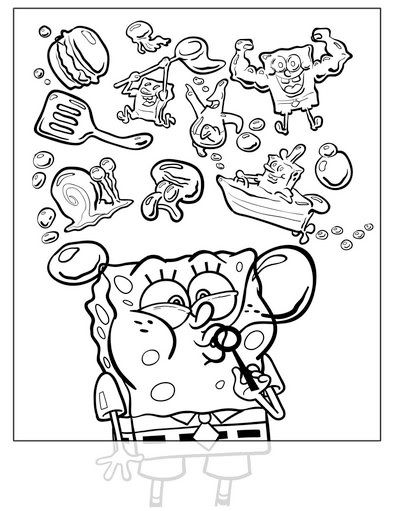
After submitting the above pencil drawing to Nickelodeon Magazine, the editors just asked me to change SpongeBob's eye direction. Originally they wanted him looking right at the "camera," but now they wanted me to have him looking at the bubble. Okey-dokey...no problem. Here's the inked version (below). I do all this sort of inking in Adobe Illustrator, using the freehand brush tool.
Finally, I "painted" the background using some pieces from stock backgrounds from the series that were painted long ago. I added the flower clouds by hand, and then blurred them in Photoshop. The hard part was getting the bubbles to look right; Each one has four layers with various transparencies. The flat colors on SpongeBob were done with the eyedropper and paint bucket tools. I sample the colors off of SpongeBob stock model sheets to make sure they're 100% accurate.
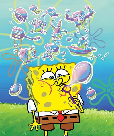
I had to leave a lot of room around the character for the Nick Magazine staff to put in all the headlines and bar codes and stuff. I kept all the bubbles on separate layers, giving the art director the freedom to move them around and resize them depending on the needs of the layout. And there you have it:


Thanks to Tim Jones, Laura Galen, Chris Duffy and the Nick Mag staff for giving me this "cover shot!"
UPDATE! The first Tutorial Videos are posted!
Keep checking this list of tutorial videos for more!
here are the first eleven
Adobe Illustrator Cartoon Inking
tutorial videos:
#11 - Illustrator Digital Inking Finale tutorial videos:
Keep checking this list of tutorial videos for more!


hi Sherm, awesome cover and post!
ReplyDeleteit was very interesting to read your proses to the finished art work.
keep this kind of post coming!
see ya
Thanks, Julian...always good to hear from you. I'm glad I compulsively digital image files and scans of my work...makes it easier to post stuff like this. If enough people like it, I'll post some more.
ReplyDeletePS...thanks for filling out the Storyboard survey! ^_^ --Sherm
Congratulations!! Nice work as always!!
ReplyDelete